Tuesday, October 19, 2010

Cover Up.. Again!

When a person sees the book first, they would see the cover. What sort of impression does that give them? What would draw them to actually taking the time open the cover.


Keeping this in mind and my earlier explorations with leather, I have decided to work with cloth instead. After an initial meeting with the printers Welpac and seeing what possibilities are there, cloth is the choice for creating the cover.


The cover will have colour as all the pages inside are in shades of black and white and text is black. There are few hints of colour, but to tie together with an interesting, colourful and kitsch-ish cover would definitely want someone to pick up the book and look inside.


Moodboard (for colours and illustration/pattern generation):
Ideas for potential covers:


Saturday, October 16, 2010

Screen Prints

To break the monotony of the letterpress prints. I have added photographs of the space I have been working at and will screen print over them.
The idea is to give a sense of space (and help the viewer connect with the surroundings I was working in) and show in some way the process involved to create the letterpress prints. Photographs includes material that I have been working on, making the imagery relevant.
The content screen printed over, gives an added layer of information that helps tie it all together.


Tuesday, October 12, 2010

Round 3: Test Prints go Metallic!

Another round of test prints to figure out what stock would work better. The earlier stock I had tried out gave the project an "old world" feel. However the feeling of preciousness was lacking. So I decided to try out some more options ranging form bright white to metallics.

I also thought of dividing the book into sections. Each section would have a different kind of stock.
The 3 sections are as follows:
  • General information about letterpress
  • Quotes from designers, typographers etc.
  • Quotes from letterpress printers - death of letterpress
The stock was bought from Transasia Fine Papers Pvt. Ltd. This is the list of stock that was tested out for the final book:
  • Conquerer Diamond White 250gsm
  • Shiro Echo Bright White 250gsm
  • JC Colorscope Pristine White 270gsm
  • Village White 280gsm
  • Rives Traditional Ice White 250gsm
  • Conquerer Iridescent Silver Mist 250gsm
  • Curious Metal Galvanised 250gsm
These are some of the test prints.

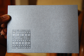
Another test print which is more of a design than content that gives you information. The pattern has been made using a "tombstone". (Wikipedia Article: Tombstone [Typography] )


The Rives Traditional Ice White 250gsm being used for one of the sections.

Monday, October 11, 2010

Cover Up

I tried out leather as a primary option for creating the cover for my artist book. In this case, it's more a pouch than a conventional cover.
One of my early inspiration came from this pouch (in terms of the craftsmanship):
I bought a piece of untreated leather and then had laser etching done, which looked really good. However, because of burning the leather everytime you touched it your hands would get black. Not favourable if you want to touch the pristine white contents of the leather pouch.


To tackle the soot getting on to your hands I decided to get it treated. So with the help of the shop keeper from where I had purchased the leather and showing him what was happening to the leather, I got a "finishing" lacquer. This gave the leather a sort of shine and changed the colour and made it a darker brown. This extra coat helped in getting rid of the soot problem.


Tuesday, October 5, 2010

Round 2: Test Prints

This time took some more test prints but with three different kinds of stock. Took about half a day to get seven different 'pieces' printed.
The stock was bought from Fedrigoni. The three different types of stocks I tried were:
  • Old Mill Banco 250gsm
  • Century Cotton Laid 280 gsm
  • Splendorgel Avorio 300gsm
These are some of the test print that I took. Rather happy with some of the results. Fine tuning will be done during the final prints. Legibility cannot be compromised.


But as Alan Kitching said "Print wasn't meant be perfect".

It looks like a walk in the park to put these compositions together, but it takes forever. And when you are looking at tiny alphabets, you don't realise when you wrote "thingi" instead of thing. The original composition has now been corrected.

 Tables are perhaps some of the most time consuming compositions to make in letterpress. You have to actually calculate and think in points to get accurate positioning in the table.
 Large body of text with justification seems so simple on a computer, but doing this manually for every line definitely gave me new found respect for justification. Especially, when I had to reset the text a second time after the printer dropped it while setting it in the chase for the first round of test prints.
 Just a fun composition that was made using old blocks. Some of these haven't been used for years. Some of the blocks were made of lead and wood and some were the newer polymer blocks.
 Tried experimenting with lines of horizontal and vertical text.
 These were literally the last few pices of Kannada type that I found lying around. SO I thought I would use them in one final composition that spoke about the rate at which type is sold off as scrap metal in India.

Friday, October 1, 2010

For the Teacher..

On Monday I had some pictures clicked as a part of my artists book. These photographs have been clicked by my friend and class mate Vishnu.


This book is dedicated to Mr.Laxmikanth, the man who taught me everything during my one month of working at the printers.
Some of the images below will have captions/ quotes letterpressed (or screen-printed, depending on which medium works well). This is in hopes of tying together what sort of a place Konark Printers and give people an opportunity to visualise the work space.
 7hrs of standing, is sooo painful. You don't realise it till one leg starts hurting and then you know all your weight was on that one leg for the past 1hr. ATTENTION is the key.

 
Quotations


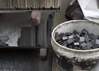
 At the end of the day, to avoid lead poisoning.. there's a bucket of cold water and a bar of rin to wash your hands with.