Wednesday, November 10, 2010

Conversations...

The interviews I had shot at the start of my project were for research purposes and for creating an online archival. However since most of the conten of the interviews was repitative, I decided to not make an archival.
However, I thought that some of things the different printers had said were opinions and experiences that could be combined together into a short film. The aim of this film would be to give the audience a glance into the world of letterpress, how it works, what are the opinions of the people who work with and whether they think there is a future or not.
My interviews were of an informal nature (which was a conscious choice). So I thought I would compile some of the things that were said to make a piece that combined these conversations and gave the audience something to see, visualise and think about.
Hence the film is called “Conversations about Pressing Matters”. This combines the informal interviews and the name of the letterpress book and leaves it open ended for a viewer to draw his own conclusions. 


Tuesday, November 9, 2010

QR Code (How it works)

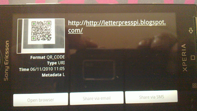
When the phone is held up against the poster, the mobile phone’s camera reads the QR code (using a QR code reader application).
On reading the data embedded in the QR code, the application takes you to the link. The user can then browse that link with the internet connection on his / her mobile phone.


POSTERS!

It was a last minute decision to create a seris of posters about letterpress printing.
To add some sort of drawing force to the exhibit space, large scale screen printed posters that would draw the audiences’ attention seemed appropriate.
To add another layer I embedded a QR (Quick Respone) code, which links to this blog. 
(A QR Code is a matrix barcode (or two-dimensional code), readable by QR scanners, mobile phones with a camera, and smartphones. The code consists of black modules arranged in a square pattern on white background. The information encoded can be text, URL or other data.)
LINK: http://letterpresspi.blogspot.com/

To print A2 posters on paper is really difficult as most screen printers do not print beyond A3. So instead of printing on paper, I decided I would print on cloth and have a screen printer who prints bed-sheets etc. do the screen printing part.

Since I had photographs in the background, I had those printed digitally with the QR code on cloth at Welpak. The screens were prepared at Jai printers who print on tshirts, bed-sheets, pillows, jeans etc.
After printing on cloth, the poster were taken to the screen printers where a single print of each poster was made.

Below are some of the process and end product pictures:


Pressing Matters.. PRINTED

I decided to use three different metallic sheets for the three different chapters.

– Rives Traditional Ice White 250gsm
– Conquerer Iridescent Silver Mist 250gsm
– Curious Metal Galvanised 250gsm

For the more fun, light hearted prints I used coloured paper.
The coloured paper stock was Canson.

– 133 Bonbon 150gsm
– 132 Clementine 150gsm
– 136 Ciel 150gsm
– 139 Prairie 150gsm

The sheets were taken to the printers and they were cut into the appropriate size.

All my composed matter waiting to be printed.

Each of the pages is composed and then thread is tied around it to keep it all in place.
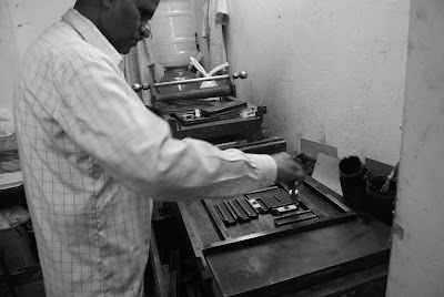
Each piece is then taken and put into the chase so that it can be made read for attaching onto the platen printing press.

Registeration on the paper is extremetly important. The printer first took one test print and then using pins aligned the paper correctly. This whole process is largely a very visual one.
Sometimes the pressure on certain letters was not enough, so pieces of paper were stuck behined to give added pressure.
Printing out approximately over 700 pages in letterpress was a time consuming task and took over 10hours.


Final Screen Prints for the Book

Final screen prints of some of the pages in the letterpress book.

Cover Up... FINALLY!

My first idea for the cover was to work with completely graphic patters, that were not associated to letterpress, something that helped me break from the grid. However I realised that this was too disconnected from the book itself. 


After my review, I went back to the content I had generated for the book and tried to figure out what I could use.
Similar to my earlier idea, I wanted to have 30 different covers since that is really easy to create in a digital medium and equally simple to print.
So using the second colour way that consited of turquoise and grey different covers have different logos highlighted (using the turquoise).Since there were details in the logo that would get lost if screen printed I decided to print on cloth. On my second visit to Welpak I decided to print on canvas instead as it was sturdy and made a more solid cover. The canvas I used had a glossy finish. 

The letterpress printed blocks:

Final Covers:

The final book wrapped in the glossy canvas cover, with a purple ribbon used to tie. The label is attached to the ribbon. (Also with each book is a pair of white gloves, not in picture)


PRESSING MATTERS.. The new Logo...

Since I would be printing digitally I thought I would add a hand done element to the ‘Pressing Matters’ logo. So I started writing out the word ‘matter’ and then decided to digitise it, without loosing the hand done quality.

The new logo I designed needed to look closer to the letterpressed version of ‘Pressing Matters’ (which was written in Unviers regular and italics). THUS, the final logo above (since fonts were no longer an issue on the computer I moved to Scala Sans, as it still tied back to the book).


Tuesday, October 19, 2010

Cover Up.. Again!

When a person sees the book first, they would see the cover. What sort of impression does that give them? What would draw them to actually taking the time open the cover.


Keeping this in mind and my earlier explorations with leather, I have decided to work with cloth instead. After an initial meeting with the printers Welpac and seeing what possibilities are there, cloth is the choice for creating the cover.


The cover will have colour as all the pages inside are in shades of black and white and text is black. There are few hints of colour, but to tie together with an interesting, colourful and kitsch-ish cover would definitely want someone to pick up the book and look inside.


Moodboard (for colours and illustration/pattern generation):
Ideas for potential covers:


Saturday, October 16, 2010

Screen Prints

To break the monotony of the letterpress prints. I have added photographs of the space I have been working at and will screen print over them.
The idea is to give a sense of space (and help the viewer connect with the surroundings I was working in) and show in some way the process involved to create the letterpress prints. Photographs includes material that I have been working on, making the imagery relevant.
The content screen printed over, gives an added layer of information that helps tie it all together.


Tuesday, October 12, 2010

Round 3: Test Prints go Metallic!

Another round of test prints to figure out what stock would work better. The earlier stock I had tried out gave the project an "old world" feel. However the feeling of preciousness was lacking. So I decided to try out some more options ranging form bright white to metallics.

I also thought of dividing the book into sections. Each section would have a different kind of stock.
The 3 sections are as follows:
  • General information about letterpress
  • Quotes from designers, typographers etc.
  • Quotes from letterpress printers - death of letterpress
The stock was bought from Transasia Fine Papers Pvt. Ltd. This is the list of stock that was tested out for the final book:
  • Conquerer Diamond White 250gsm
  • Shiro Echo Bright White 250gsm
  • JC Colorscope Pristine White 270gsm
  • Village White 280gsm
  • Rives Traditional Ice White 250gsm
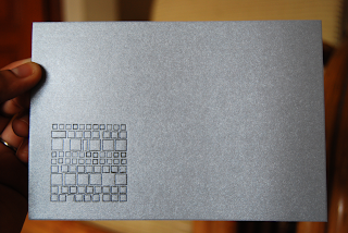
  • Conquerer Iridescent Silver Mist 250gsm
  • Curious Metal Galvanised 250gsm
These are some of the test prints.

Another test print which is more of a design than content that gives you information. The pattern has been made using a "tombstone". (Wikipedia Article: Tombstone [Typography] )


The Rives Traditional Ice White 250gsm being used for one of the sections.

Monday, October 11, 2010

Cover Up

I tried out leather as a primary option for creating the cover for my artist book. In this case, it's more a pouch than a conventional cover.
One of my early inspiration came from this pouch (in terms of the craftsmanship):
I bought a piece of untreated leather and then had laser etching done, which looked really good. However, because of burning the leather everytime you touched it your hands would get black. Not favourable if you want to touch the pristine white contents of the leather pouch.


To tackle the soot getting on to your hands I decided to get it treated. So with the help of the shop keeper from where I had purchased the leather and showing him what was happening to the leather, I got a "finishing" lacquer. This gave the leather a sort of shine and changed the colour and made it a darker brown. This extra coat helped in getting rid of the soot problem.


Tuesday, October 5, 2010

Round 2: Test Prints

This time took some more test prints but with three different kinds of stock. Took about half a day to get seven different 'pieces' printed.
The stock was bought from Fedrigoni. The three different types of stocks I tried were:
  • Old Mill Banco 250gsm
  • Century Cotton Laid 280 gsm
  • Splendorgel Avorio 300gsm
These are some of the test print that I took. Rather happy with some of the results. Fine tuning will be done during the final prints. Legibility cannot be compromised.


But as Alan Kitching said "Print wasn't meant be perfect".

It looks like a walk in the park to put these compositions together, but it takes forever. And when you are looking at tiny alphabets, you don't realise when you wrote "thingi" instead of thing. The original composition has now been corrected.

 Tables are perhaps some of the most time consuming compositions to make in letterpress. You have to actually calculate and think in points to get accurate positioning in the table.
 Large body of text with justification seems so simple on a computer, but doing this manually for every line definitely gave me new found respect for justification. Especially, when I had to reset the text a second time after the printer dropped it while setting it in the chase for the first round of test prints.
 Just a fun composition that was made using old blocks. Some of these haven't been used for years. Some of the blocks were made of lead and wood and some were the newer polymer blocks.
 Tried experimenting with lines of horizontal and vertical text.
 These were literally the last few pices of Kannada type that I found lying around. SO I thought I would use them in one final composition that spoke about the rate at which type is sold off as scrap metal in India.